Reply Munich
Client
Location
Services
Space allocation program, integration planning, definition of fit-out standards, colour and material concept, design and planning of special areas, project management.
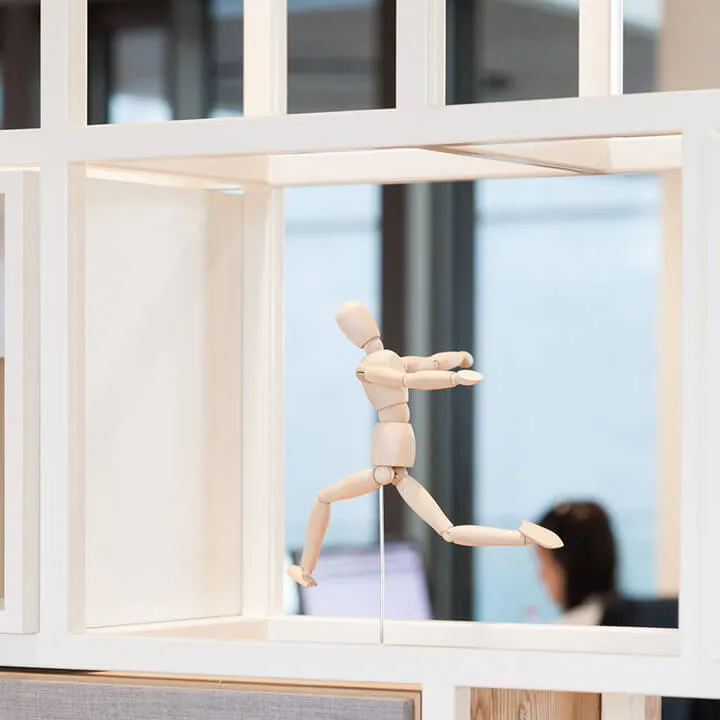
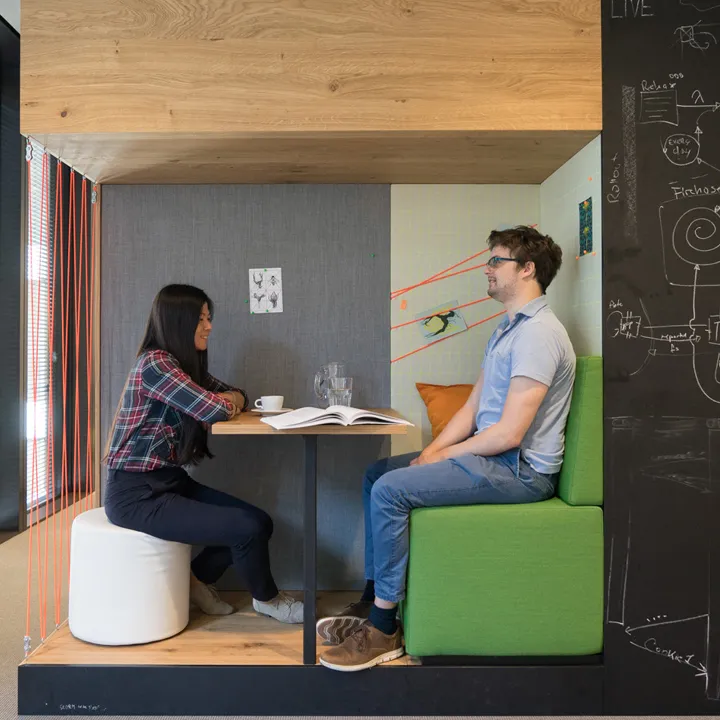
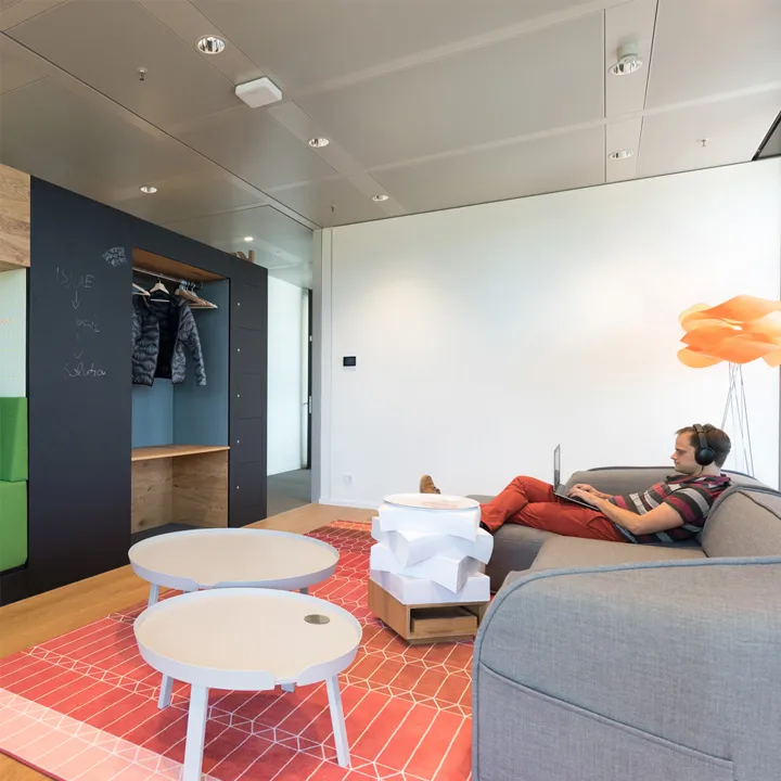
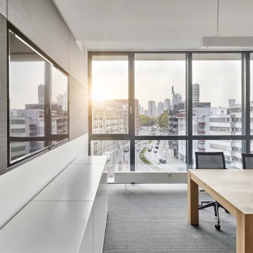
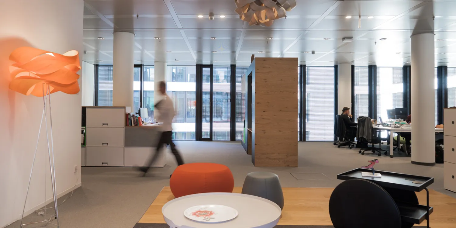
The new office our team designed for Reply serves as the brand’s flagship and a model for all other European locations. The objective of our design was to break down the physical barriers between rooms and develop a work environment with a flexible layout that fosters co-creation and innovation. We combined open plan offices and private one-person or two-person offices with zones for interaction and quiet contemplation such as lounges, terraces and a cafeteria, giving employees the high-quality spaces they want and the flexibility to use them as needed. In collaboration with Reply, we developed a colour and material palette that will serve as the brand’s Corporate Design in all branch offices, while also allowing scope for location-specific accents. At the Munich location, for example, there are distinctive, colourful large-format carpets as well as floor-to-ceiling living walls, either free-standing or on internal walls. A special shelving system is used as visual and spatial dividers for open zones such as the photocopier alcove or the archives.


